The Distribution of Global Warming
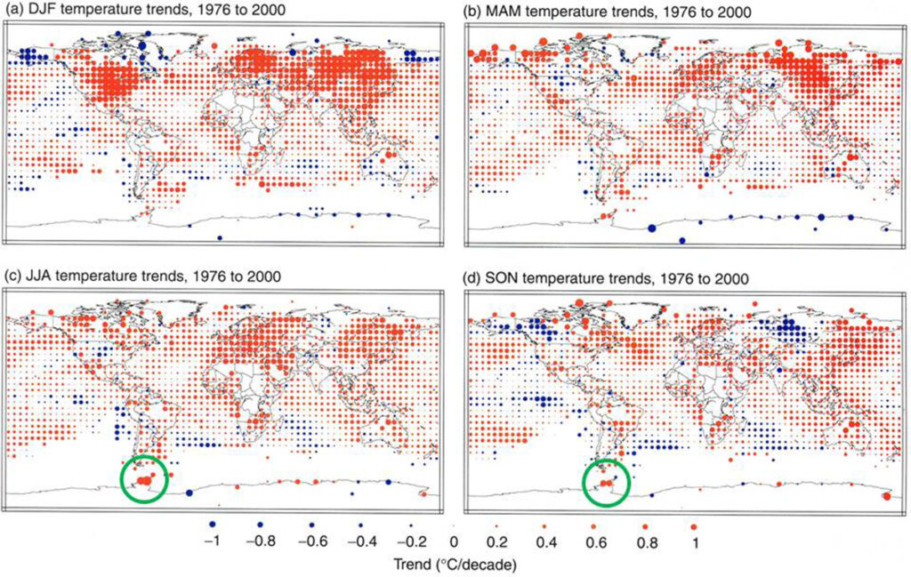
The largest warming trend in the world between 1976 and 2000 was near the Antarctic Peninsula during June-July-August and September-October-December (large green circles). Seasonal surface temperature trends for the period 1976 to 2000 (°C/decade), calculated from combined land-surface air and sea surface temperatures adapted from (Jones et al., 2001). Monthly intervals are December, January, February (a), March, April, May (b), June, July, August (c), and September, October, November (d). The red, blue and green small circles indicate areas with positive trends, negative trends and little or no trend respectively. The size of each circle reflects the size of the trend that it represents. Trends were calculated from seasonally averaged gridded anomalies with the requirement that the calculation of seasonal anomalies should include all three months. Trends were calculated only for those grid boxes containing seasonal anomalies in at least 16 of the 24 years. Figure 2.10 from Folland et al. (2001).
Figure 3.10 in Trenberth et al. (2007) provides an update of this figure, but shows little data in Antarctica because of the criteria used for plotting.